Finding Colour Inspiration for Memorial Templates in Unexpected Places
Apparently, when I’m asked to go on a colour walk, I go shopping.
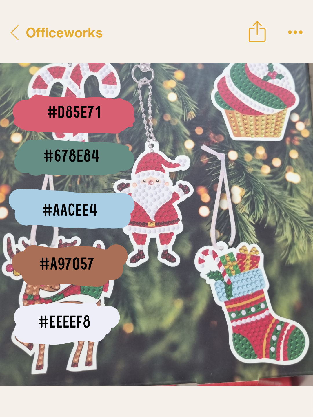
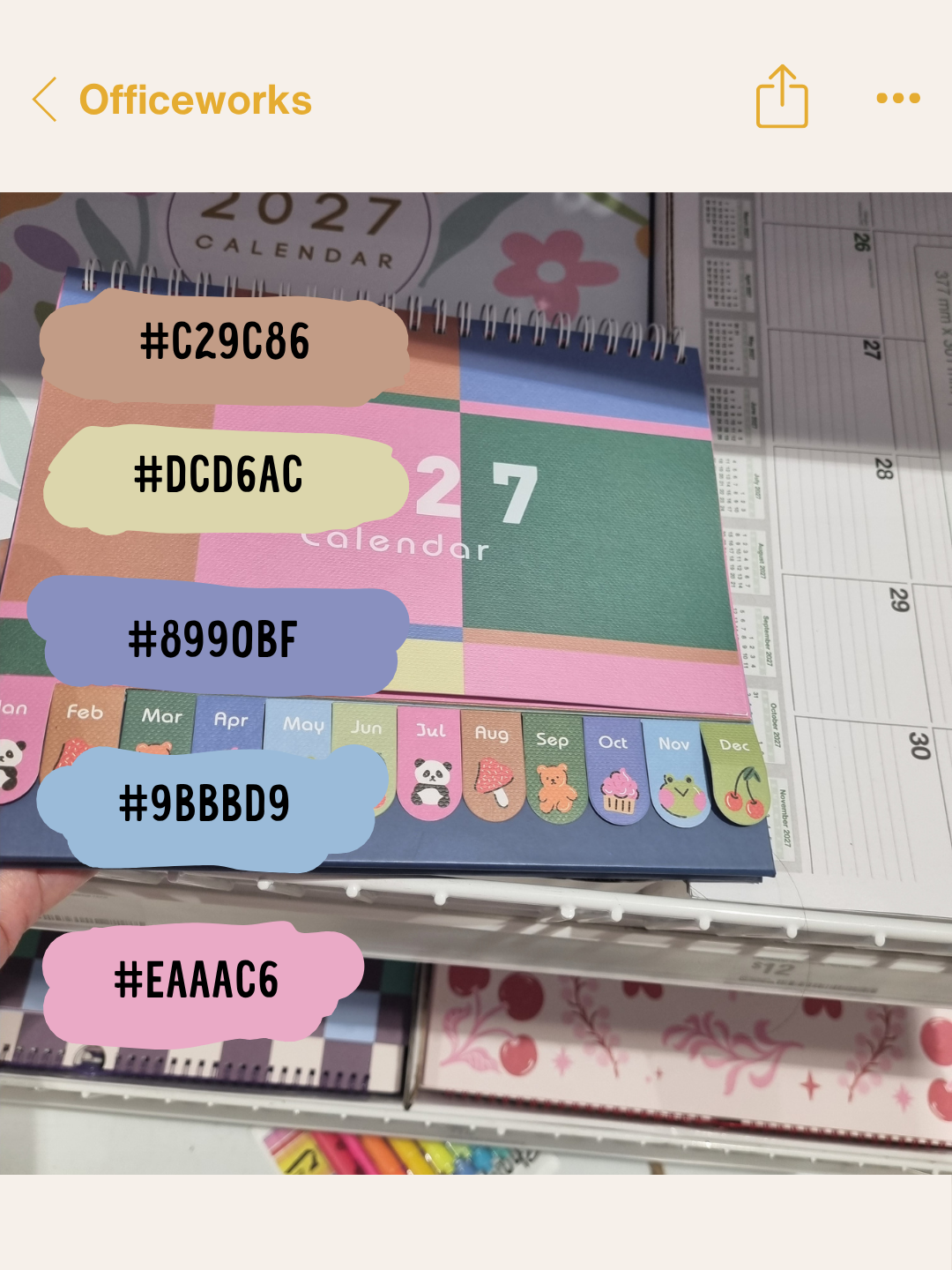
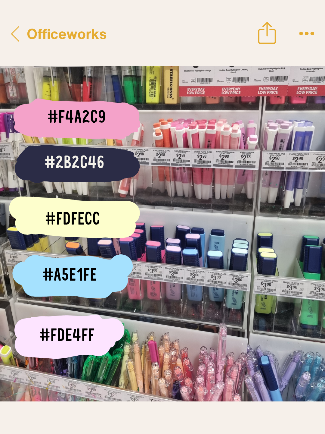
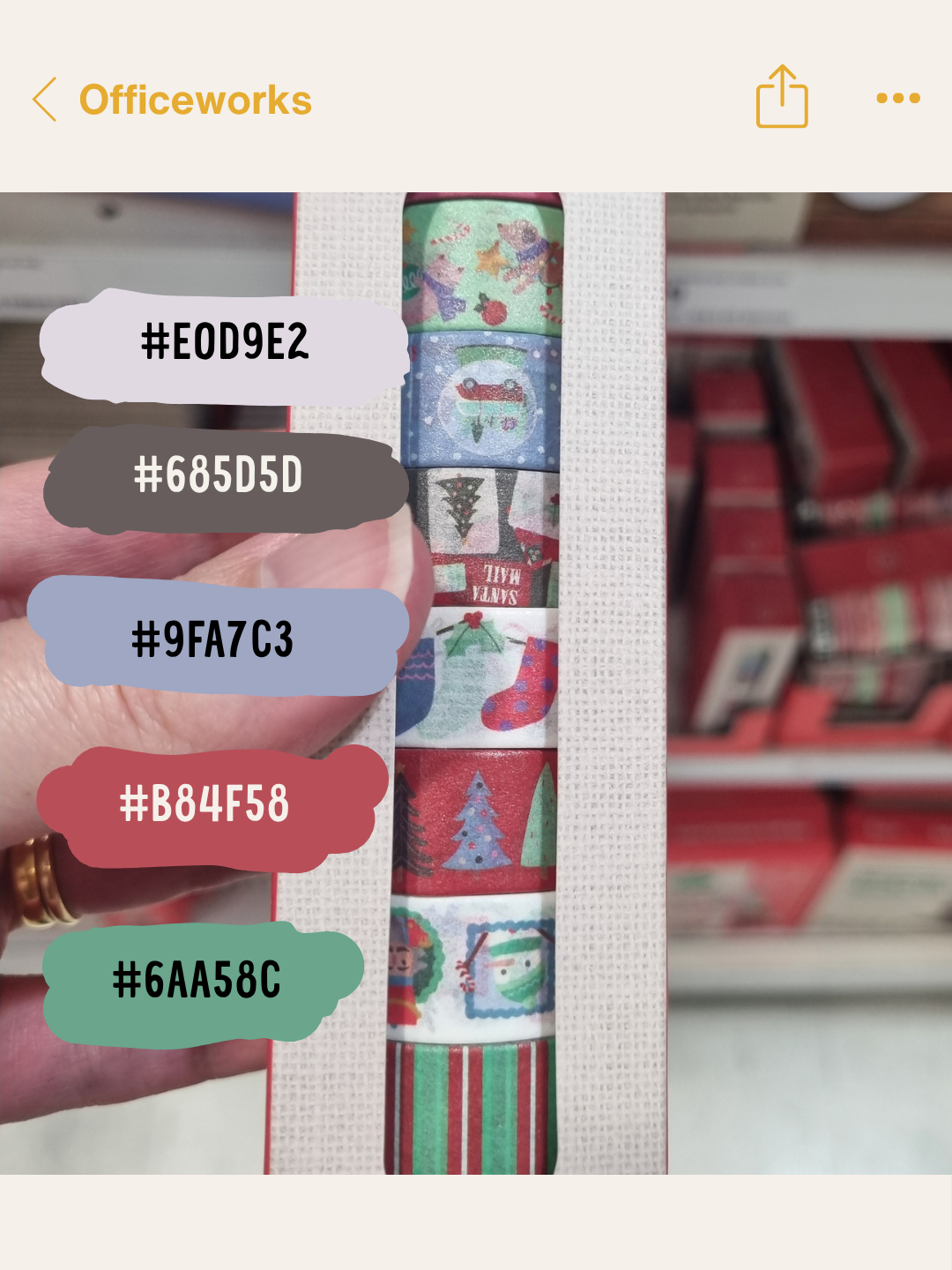
During the first week of this Creative Pals theme, I took my camera to Officeworks. If you’re not from Australia, Officeworks is our stationery, office supplies and printing shop. It’s a similar idea to Staples in the USA, although not quite as large.
A shop filled with stationery, packaging and colourful displays is a fairly obvious place for me to look for inspiration. I love stationery, so wandering through Officeworks and taking photographs of interesting colour combinations didn’t feel like much of a hardship.
My second colour walk was slightly less predictable
This week, our Creative Quest was to go on another colour walk. As I like to be different, I went to Bunnings.
Bunnings is a huge Australian hardware store that sells tools, paint, plants and all sorts of things you didn’t know you needed until you walked past them.
Paul loves Bunnings far more than I do. There are too many boy toys for me, and I’m not particularly interested in drilling and smashing shit. Give me the paint cards, garden section and colourful pots instead.
The location changes what you notice
Taking the two colour walks in completely different shops showed me how much the location influences what catches your eye.
Officeworks naturally led me towards stationery colours and combinations designed to grab attention on a shelf. Bunnings gave me painted surfaces, practical objects and colours arranged together for reasons that had nothing to do with graphic design.
That is what made the second walk interesting. I wasn’t looking at somebody else’s finished artwork or trying to extract my own idea from a Pinterest image. I was noticing colours in an ordinary environment and wondering what else they could become.
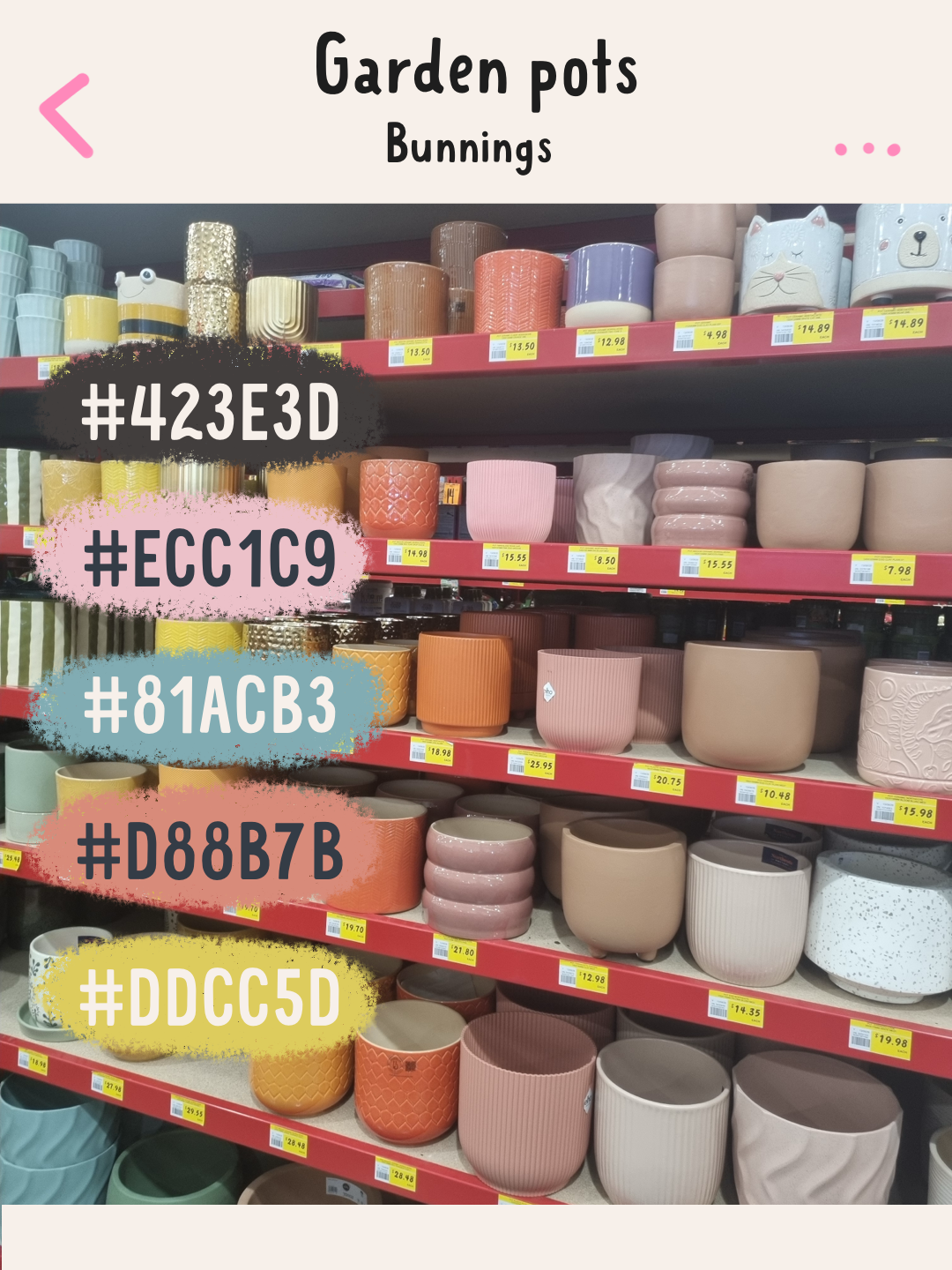
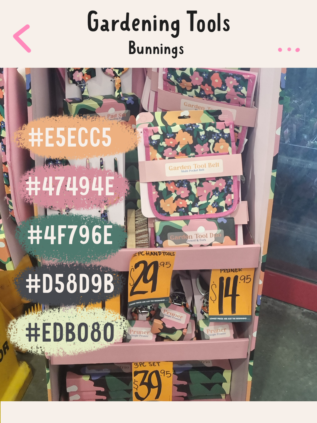
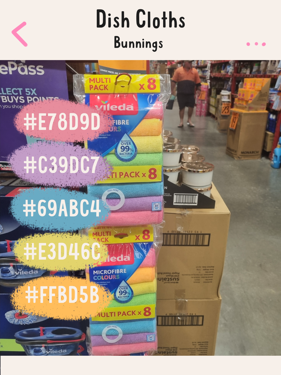
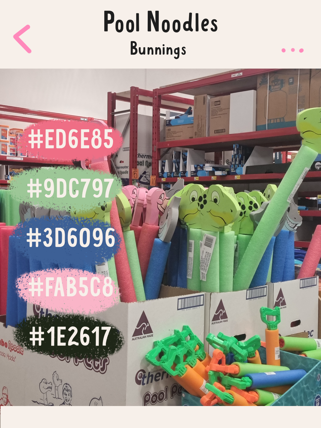
The photos include some of the palettes I created from both sets of photographs.
A display of pots gave me an unexpected direction
The palette that keeps pulling me back is the one taken from the pots at Bunnings. It has warmth and personality without feeling loud for the sake of it.
I’m currently thinking about a Celebration of Life collection, which may include memorial templates people can personalise for somebody they have lost. I want the collection to feel respectful, but I also want it to look different from much of what is already available.
A celebration of somebody’s life doesn’t automatically need to be beige, pale blue or covered in soft watercolour flowers. Those styles suit some people beautifully, but they don’t represent every person or every life.
Some people filled rooms with colour. They had favourite clothes that everybody remembers or surrounded themselves with objects that made them smile. A memorial created for them should be able to carry some of that personality.
Colour can hold more than one feeling
Designing memorial templates requires care because the colours need to support the photographs, words and memories rather than compete with them.
That doesn’t mean the palette has to feel sombre.
Colour can be warm without being inappropriately cheerful. It can feel comforting while still acknowledging why people have gathered. The right palette can help a memorial feel personal rather than formal or generic.
That is what interests me about the colours from the pots. They feel grounded and warm, but they still have enough character to create something memorable.
Inspiration doesn’t care where you find it
Neither of these colour walks involved strolling through a picturesque garden or standing beside the ocean waiting for inspiration to arrive.
One happened at Officeworks. The other happened at Bunnings.
Both made me slow down and look more carefully at things I could easily have walked past. The Officeworks trip reminded me how colour is used to attract and delight us. The Bunnings trip gave me an unexpected direction for a sensitive collection I had already been thinking about.
Creative inspiration doesn’t always arrive while you’re sitting at your desk trying very hard to have an idea. Sometimes it is waiting beside the notebooks or sitting in a stack of plant pots.
The useful part is learning to notice it.
I’d love your honest opinion
I want the Celebration of Life collection to feel different, but it also needs to be something people would genuinely feel comfortable using when remembering somebody they loved.
What do you think of the palette inspired by the pots? Would those colours feel appropriate for a celebration-of-life or memorial template, or would you look for something softer and more traditional?
I’d genuinely love to know.


Two Creative Pals colour walks through Officeworks and Bunnings led to an unexpected colour palette for my Celebration of Life memorial template collection.